Dashboards
The insigh.io Console provides highly customizable visualization options for the received device data. Dashboards group together widgets of various types (e.g., line charts, bar charts, tables, etc.). Users can create multiple dashboards per project and each dashboard may contain several widgets.
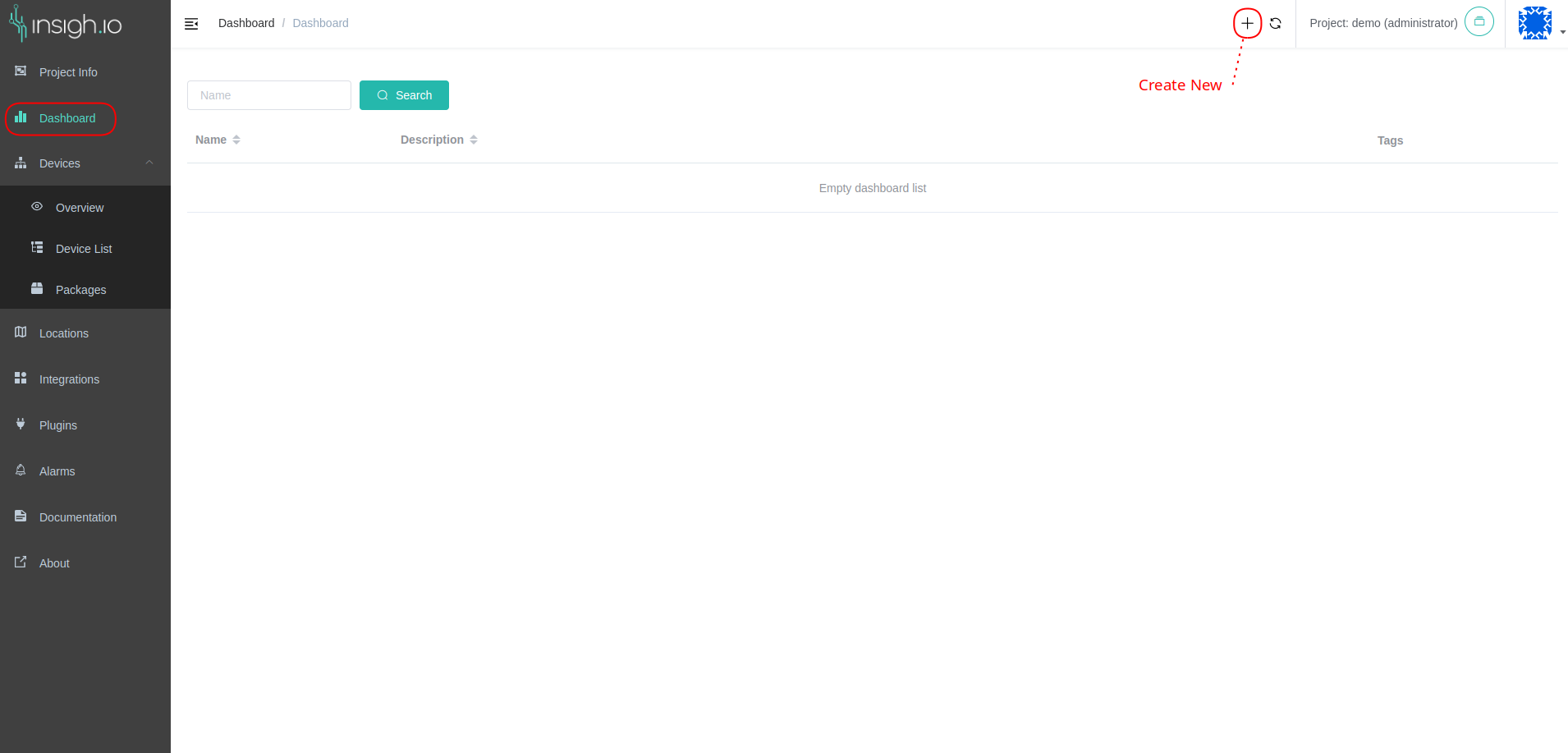
To create a new Dashboard, go to the Dashboard and click the “Add new” button at the top-right corner of the screen.
🔐 Project viewers are not allowed to create dashboards. The relevant button is hidden.
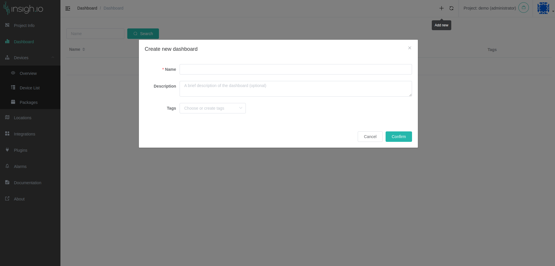
The Dashboard form dialog appears. Each dashboard has the following attributes:
- Name: mandatory: the dashboard name
- Description: optional: a short description of the dashboard
- Tags: optional: tags related to the dashboard
When you create a new dashboard, it is added in the dashboard list. Click on it to go to this dashboard’s view and add widgets to it.
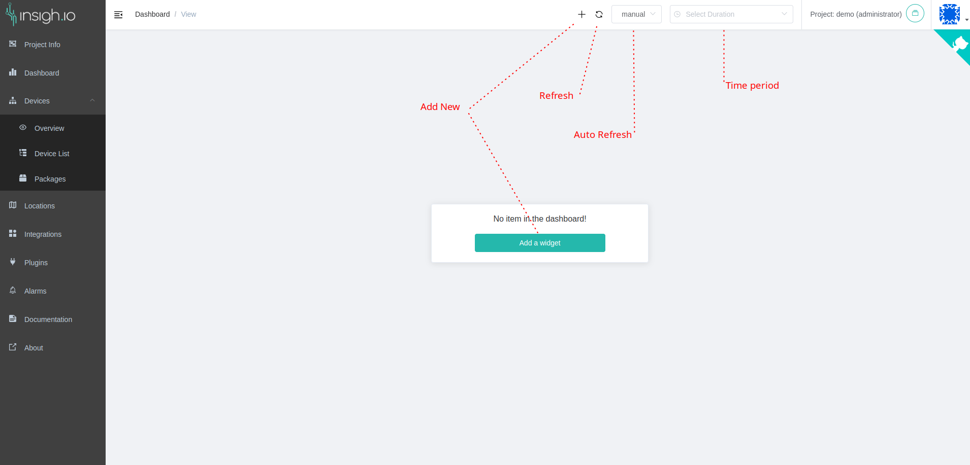
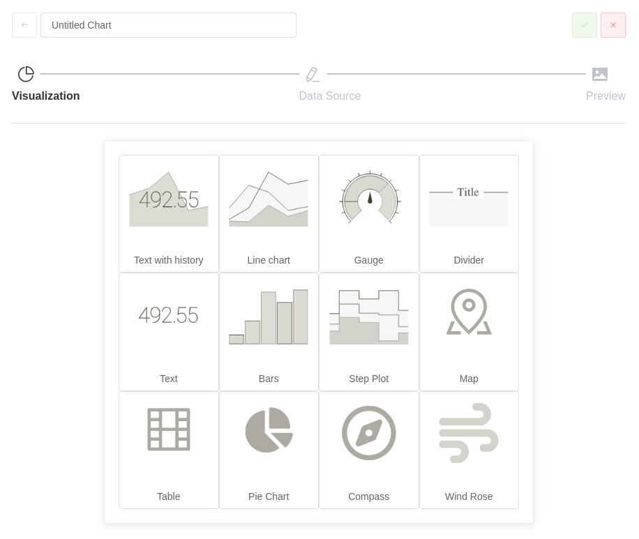
By clicking the Add New option, the Chart Wizard is displayed that will go through steps to accurately define the required settings per widget type.
The supported widget types are:
- Text with history: Line chart without axis values that contains text in the middle responsible for displaying the current value and the percentage of difference between current value and the value before the defined period of time. This type is recommended to see the trend and the percentage difference of a measurement in a period of time.
- Line Chart: Simple Line chart graph, good for displaying most of the device measurements.
- Gauge: Gauge view for displaying numeric values in a defined value range.
- Divider: Simple visual and organizational tool to separate charts in groups.
- Text: Displays the current value of the selected measurement regardless of the measurement data type (i.e., numeric or text).
- Bars: similar to Line Chart though the data lines are displayed in bars.
- Step Plot: similar to Line Chart though the data lines are displayed in steps. Particularly useful for discrete measurements.
- Map: A map widget that displays markers on a map if GPS coordinates are sent by the device.
- Table: A table widget that shows the data in a tabular format.
- Pie Chart: A pie chart widget, useful to relatively compare the size of two measurements.
- Compass: A compass widget, useful when wind-related data is collected (e.g., from weather stations).
- Wind Rose: A more advanced wind-related widget.
Lets choose the Line Chart for this example. Next screen is the data input definition, data manipulation, etc.
The view contains:
- Device List: select one or more devices to operate to
- Device Measurements: shows the measurements of the devices, one or more can be selected based on the selected widget type from the previous step. If one device is selected, the list includes all the different measurements the device has ever reported. When multiple devices are selected, shows only the common measurements between the devices. To show the union of all the different measurements collected from the devices, deselect the Filter Common Measurements checkbox.
- Value Type: select to operate with the raw Value or with the Elapsed time between the Values.
- Function / Group By / Fill: Apply a function to the returned values. Optionally, this function can be applied in timed Groups (split all data periods into specific slots and apply the function to all measurements in the slot). When Group By is enabled and no value is found into a time slot, Fill option defines how to handle the missing values. All Fill options have tooltips to explain their functionality
- Duration: the default duration per widget to query for data. It is globally overridden when the user explicitly selects a Measurement Period from the Page Toolbar.
- Advanced: the checkbox that enables some more advanced features to be applied ton the query. When enabled, a pseudo-query is displayed as an example of how all the selections are applied into a query line.
- Value Filter: when filled, it can control to filter out values. For example, having a fleet of devices that report battery voltage,
"value" < 3.6will report back all the devices that have critically low battery and needs attention. - Value Transformation: when filled, the defined formula will be applied to each value before it is returned. For example, in a specific Soil Sensor, the reported values are in millivolts (mV). To express this in volumetric water content (VWC), the formula
100*(11.9*0.0001*value-0.401)is applied
- Value Filter: when filled, it can control to filter out values. For example, having a fleet of devices that report battery voltage,
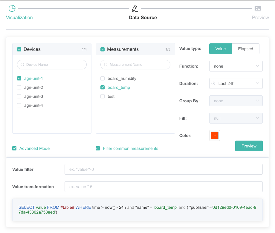
When using a Map widget, make sure to manually select both longitude and latitude from the measurement list.
Each widget configuration ends with the preview of the requested data, before it is inserted into the dashboard. When ready, click the green check button at the upper corner of the dialog and the widget will be automatically added into the dashboard.
Each widget, can be resized/moved into the dashboard space which is auto expanded.
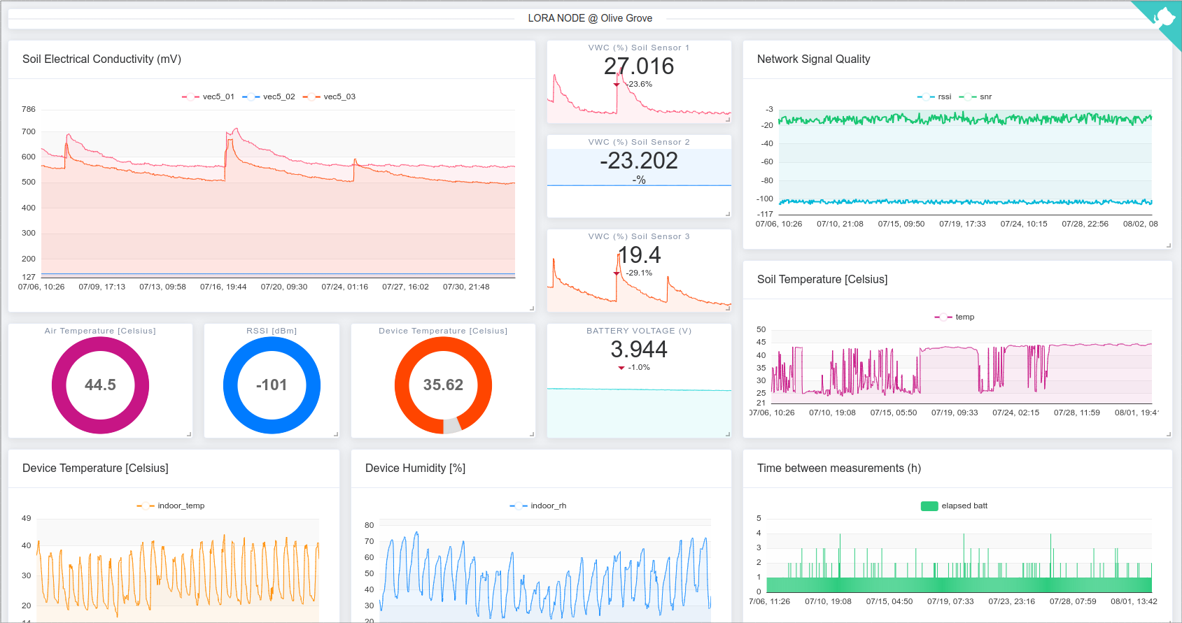
Here is an example of a dashboard that monitors the soil moisture in an Olive Grove.
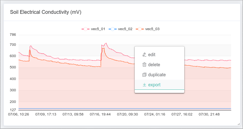
Widget’s context menu
Each widget placed in the dashboard, has a context menu to provide extra functionalities on it.
Options:
- edit: re-opens the Chart Wizard with the configuration of the widget to be edited.
- delete: deletes the widget from the dashboard
- duplicate: create a copy of the widget and place it at the end of the dashboard
- export: create and download a CSV file with all the included contents of the widget values.
🔐 Project viewers are not allowed to edit, delete or duplicate dashboards. Moreover, project editors are not allowed to delete dashboards.